|
|
|
September
2002 - Issue 16
|
|
Welcome Back! It's September and a fresh start! What have your creative pursuits been this summer? Are you a person who creates all summer long, or do you find the demands of family and visitors take all your summer hours? Or are you a person who just likes to kick back and enjoy those lazy hazy days? This summer I've actually accomplished more than I expected. Perhaps it was the need to get caught up after the broken ankle slowdown, or perhaps my tasks are a bit more defined these days, or possibly even the fear of being totally swamped in the fall. I hired an assistant to help me out during my casted days and I think it's the best thing I have done in ages. Leslie is a needle arts person but is really enjoying learning about paper arts and is very careful in her work. She keeps me organized and focused - and that's a really good thing. Leslie gets to do the fun things, like hinges and tearing down signatures, as well as some cutting and gluing. Well, what can I say? It's bookbinding! Over the summer there have been some additions on the website.
There is now an acrylic mounts page with
information about acrylic blocks designed to go with Quietfire rubber
stamps. We have some new colours of waxed linen threads - click here or scroll down this column to see what they are! I'm starting to think I should put a table of contents in this newsletter, but that's just a tad toooooo organized. Make sure you read right to the bottom of this issue, there's some real eye candy there! You will also find a bit of a technological update. Previously when you clicked a link that took you out of this site you would have to use your back browser to return. Well, I've discovered how to make that link open up another browser window! I hope that helps with your navigations. For those of you who will be at Artwerx (Sept. 13-15,
see below, other column)- send me an email
and let me know! My acrylic friend, Susan (she's not really made of acrylic!), will also be taking pre-orders. To see her line and pricing and to contact her, click here. For those of you who were asking, Susan and I decided not to get a vendor table at Artwerx, as we would have to "man" it during class hours, and we're really looking forward to having the full learning experience! I hope you enjoy this issue of byhand! Changes to Quietfire Rubber Stamp Line Over the summer we changed our stamps and I think you'll be very pleased with them. The Gothic border now has more letters in it's alphabet! Create without Limits and Dream with your Eyes Wide Open are slightly smaller. We have plans to offer sheets of rubber in the near future, too. Anything you'd like to see? - let us know! If you'd like a copy of our little brochure including order form, send a SASE to Suzanne
Cannon American friends, please don't attach the stamps - thanks! See the new page featuring acrylic blocks designed to go with the Quietfire Rubber! Click here to see current offerings of Quietfire Rubber Stamps!
July/August Challenge
I had lots of people email to tell me how much fun they were having with their doodle challenge! You guys are so cute! If you're a new subscriber and you don't know what I'm talking about click here for a complete description. You may see the submissions on the I had lots of emails saying you'd printed out the grid or had done some of it, but didn't get it all done. I'll be happy to post them on the Subscriber's Gallery page when you send them. The first 5 submissions postmarked after August 15 were: Joan Byers They will receive little rewards for their work and timing! Now, I had a couple of over-enthusiastic players who mailed in their doodles too early.... and they, too, shall be rewarded for their enthusiasm. Thanks to all of you who sent in your
Doodles.
|
Important links at your fingertips! Back Issues of byhand How to subscribe and other stuff! If you wish to contact me, my email address is: suzanne@quietfiredesign.com To subscribe: send me an email
saying 'subscribe'!
Please feel free to browse through my
website Site Siting
Those
of you in the Lower Mainland and on Vancouver Island are bound to know
about Paper-Ya, a wonderful paper and gift store on Granville Island.
Well, now they have their own website. Check it out at
Over the summer
I did my fair share of trashy reading - love those murder mysteries
- James Patterson, Janet Evanovich and at the other end of the spectrum
Kathy Reichs. Each short essay could be read very quickly and superficially. But I found myself realizing that there was a much deeper message in almost every page. You really need to own this book if you like her work. I know I will be able to pick it up another time and mine new meanings from passages that I didn't "get" the first time around. I filled two pages of my journal with thoughts and quotes that came out of this book. If you've read Everyday Sacred, let me know what you thought of it! Studio Tips Lizard shares a tip she's transferred
to bookbinding practice after years of creating teddy bears!: Many of you know that I carry rubber fingers (the kind the tellers use when they count money) with me to classes and use them all the time at home. This has become more difficult lately, as my cat has decided he likes to play with rubber fingers and will tramp all over all my art supplies to find them... Suddenly pliers seems like a great alternative... I'd be delighted to receive your favourite tips for inclusion here - we can all learn from them and probably save someone - like me - frustrations! |
|
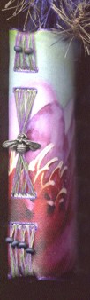
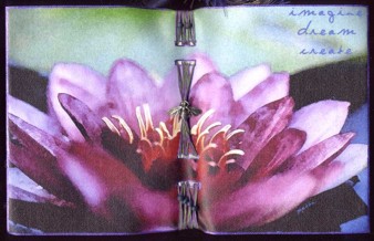
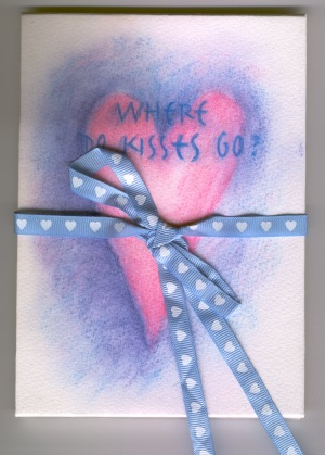
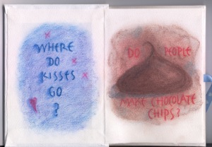
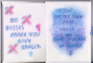
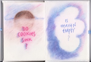
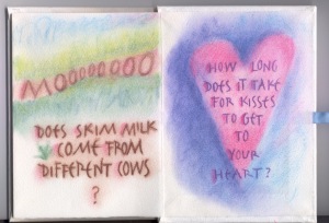
Gentle Thoughts
This was a little book I made several years ago. It was my first attempt using pastels and Conte crayons for something. I think you can probably guess that the authors of this book were my two boys.
|
|||||||
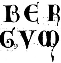
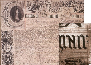
Calligraphy, Chemistry and Canadian HistoryWell, I ask you, how can you go wrong with a title like that?
Recently a publication came across our doorstep, the ACCN, published by the Chemical Institute of Canada, of which I used (in another life) to be a member. (It's my husband that receives it now!) Well, my interests have changed (no kidding) and I usually pay no attention to it when it arrives. But this time, well, I carried it around for days worrying that it would get lost in the shuffle before I read it.... It had a manuscript on the cover! The manuscript was the charter to the Company of Adventurers of England - which later became the Hudson's Bay Company - and was dated May 2, 1670. If you are Canadian, you will be well acquainted with the company, and will have likely shopped there at some time in your life. It is a department store with deep roots in Canadian History.
The Hudson's Bay Charter now resides in the company's head office in Toronto, Ontario in a hermetic, low oxygen glass display case. ACCN Canadian Chemical News July-August 2002 Volume 54, No. 7. Article by Gregory S. Young, PhD. Canadian Conservation Institute. |
|||
|
Alphabet Tag Swap II The July/August issue of byhand saw the last of the original round of alphabet tags. A smaller group of us decided that we would like to finish the alphabet, so I assigned the last few letters and we were off to creating! If you're interested the background of this swap click here to read what we did!
Fall Challenge - The Next Swap! calling all creatively-minded people! It's time for another swap challenge. Here's how to play! What I would like to propose is a Seasons Swap on tags. The first thing you will have to do is email me and sign up! I will assign you a season and you will decorate shipping tags - all the same decoration and as many as there are people in the swap and send them to me with a SASE. I will swap all the tags out and send them back to you. How many you have to make depends on the number of players. I promise I won't have you make too many! Seeing there are only 4 official seasons, you will almost certainly get someone else doing the same season as you - but that's half the fun! Please sign up by Sept. 15, I will send out more information to the swapees soon. Let me know if you're a newbie at this! As usual, I'll be crushed if nobody signs up....... For those who have never participated in a swap
here's what happens.
|
The Flat Salon Sister's World Tour 2002 - Part I |
|
|
Many of you either know about or have
met my If not, let me give you some background. This is a round robin devised by the women of Belle Papier, which is an online group that I have the pleasure of belonging to and have talked about many times before in this newsletter. This round robin was irresistible! It came about during online posts on the theme of "wouldn't it be wonderful if we could all get together somewhere?". The subject of Flat Stanley came up at the same time. (If you're not familiar with the book Flat Stanley, you can read the short write up in the next column.) And you can see where a group of fertile imaginations could take this.... We were divided up into groups as so many people had signed up for the event. Flat Suzanne was going to be traveling all across the States. What would she wear??? The hardest part was making Suzanne flat... Kelley, my first visitor, had planned to use a rolling pin to make herself flat. Myself, I was headed for some road construction - they have *real* rollers there.... Flat Suzanne left in February on her big trip, with only her clothes and journal. Her first hostess, Leslie in Colorado, was very kind and bought her a camera. Flat Suzanne was very slow arriving in Colorado and it turns out she took a detour to Salt Lake City... but more about that next month. I'd like to introduce you to the Flat Salon Sisters in my group!
|
Flat Stanley by Jeff Brown is a children's book about a small boy whose bulletin board falls on him. Suddenly, he is flat. His brother thinks this is fun as he can use Stanley as a kite. And Stanley rather likes it because he can slip under doors without opening them. But the best part is that he can visit his friend who has moved away, because his parents can put him in an envelope and mail him! And thus was born the Flat Salon Sister Tour....
Note how careful one must be in the typing of the word Flat. One small slip and my Salon Sisters would be the opposite of Flat...
If you take a tour through the Class Photos section of this website, you will see several Salon Sister's faces peaking out as they pose with workshop participants! |
|
This is Flat Kelley from Jacksonville, Florida and was the first to arrive. Kelley was also the organizer of this epic event! |
|
|
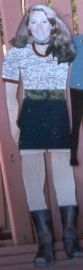
Please meet Flat Linda! Don't you think she's a bit young to be traveling alone?? |
Here is Flat Heidi. Heidi arrived in this fabulous box with beading all around the outer edge. Her journal is a tiny book wrapped around her middle. |
|
Here is Flat Merry B! After this photo was taken, Merry B. and I went to visit a local plastic surgeon to have a face lift (guess her's was sort of squashed in transit). She looked so much better after Dr. Miel -such a honey- backed her head with the top of a honey container... |
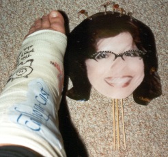
Meet Flat Ar! And yes, Flat AR was just a head, appearing similar to a plant poke (although I NEVER did that to her...). She was visiting during my, er, slow time. |
|
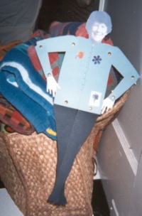
Welcome to Flat Leslie! from Colorado. As I write this she is resting on my table sorting all the photos of my Flat Salon Sisters. She arrived with Flat me, and has been traveling with Flat me for a while now. This photo was taken by Fluffy Kelley in Florida, as I haven't had a chance to take any of Flat Leslie yet. Fluffy Leslie has an amazing report of what sidetracked Flat Suzanne on her way to her place... more about that next month....
|
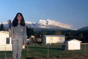
And here is Flat Suzanne from Port Alberni, B.C. Canada, in a photo taken by Fluffy Kelley, ready for the beach - but a tad overdressed - hey, it was February when I left! |
|
Waxed Linen Thread Prices: It is $0.50/yard Cdn ($0.30/yard U.S. funds) plus $2 for postage and handling .
Here is a list of the colours I currently have in stock:
New Colours!!
For those of you who have taken the Coptic Stitched Class, it takes two yards of thread to complete the book as we made it. For those of you who have taken the Criss Cross Coptic, you will require five yards per book. |
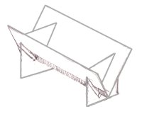
I have put together some sewing cradles for sale as some of you have been asking for them. They are not things of great beauty, but really, really handy for when you have a lot of holes to pierce. They are large enough for an 8.5" spine length and are $20Cdn (or $15US - to the States) shipping included. Email me if you can't live without one! I will try to bring these to classes so you can see them in person! |
||||||||||||||||||
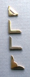 Brass
Corners Brass
CornersAs well as the waxed linen, I now have some brass corners (the 3rd one down is Nickel or silver coloured) which are 50 cents Canadian (or U$0.35) each. They fit nicely on a bookboard of about 2.25mm (or 0.09") thickness covered with decorative paper. Email me if you are interested - I don't think shipping will be too much, but that depends on the quantity! |
Don't Forget!
I'd just like to say that if you're an American subscriber, the exchange with the Canadian dollar makes this a very worthwhile event! |
||||||||||||||||||
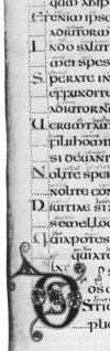
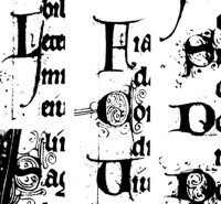
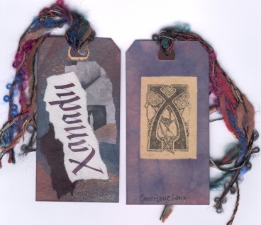
brace
yourselves...History LessonHere is the fourth installment of the information panels from my exhibition, Lines of Evolution.... Versals
|
|
Teaching Schedule To get more details about registration, please go to my website Calendar of Events page. Use the back button on your browser to return here. And yes, can you believe it, I'm already booked into January 2003! Here is the tentative schedule!
|
|||||||||||||||||||||||||||||||||||||||||||||
|
Canvas Covers
|
|
If there is any information you would like to see in this newsletter,
let me know. Each month I will email you to let you know the new issue
is published. If you know someone who would like to receive notice of
byhand, just have them email me and I
will put them on the list. Bye for now and thanks for visiting! suzanne@quietfiredesign.com |
|
|
The original title lettering of byhand was done with a Mitchell's Roundhand Nib, size 0, and Higgins Eternal Ink. Quietfire Design Rubber stamps were used to create the other designs. |


 Christiane
Lenz
Christiane
Lenz