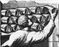
Storing scrolls in ancient Rome from A History of Reading by Canadian author Alberto Manguel.
March 2002- Issue 11
Storing scrolls in ancient Rome from A History of Reading by Canadian author Alberto Manguel. |
March 2002- Issue 11 |
|
Welcome to all the new subscribers!
Normally this newsletter comes out closer to the first of the month. Ahem. Well, I just don't know what happened to February. It was a short month, wasn't it? Well, here I am, at last, with kind of exciting news to tell you. I have always liked the idea of rubber stamping and the versatility they present. And I confess I was a rubberaholic in the early 80's. Then I went on a rubber diet. Until now. I decided that, rather than use other people's designs,
it was high time I produced my own. So today I present to you, the
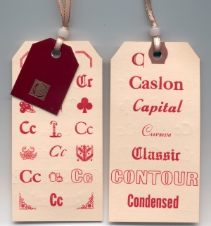
first in my selection of rubber stamps. Alphabet Tag Swap Those of you that are new to
byhand
will be unfamiliar with this swap which has just finished.
Thanks for the write-up Joan!
You can even see the impression showing through from the other side on
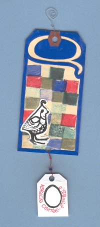
the scan. Cool. The Q tag was done by artist Ginny Porter.
Q-tag - Questioning - a "Q" word. The quail, the egg (in case you didn't get it - "which came first the quail (chicken) or the egg?") were all lino-cuts done using the "safti-cut" lino blocks (so easy to work with). At first, I thought, to make the quail image quick and easy I would find a picture of one, get it multi-printed in appropriate size, cut-out and stick-on (mini collage). Ultimately with time running out it was easier to cut my own. The quail and egg images are printed using a water soluble printers ink (black), nice easy clean-up. The quilt pattern done in fours or quartos was printed using ink pads (stamp art), the squares, two, again were cut from safeti-cut. Wire curly-q at top of tag to reflect quail. Gloss finish is Krylon gloss spray used to seal work and give it bright reflective look. P.S. And I have it from a good source that the blue Q and border were done with gouache.
Don't Forget!
|
Welcome to issue
11 of byhand! If
you wish to check back issues of byhand
click here.
If you wish to contact me, my email address is: suzanne@quietfiredesign.com To subscribe: send me an email
saying 'subscribe'! Notes I have added a printable general supply
list for bookbinding classes to my website. Books to Inspire
My friend Cathie, who belongs to a group of Goddesses (she *would*!), passed me some information about a book of lists another Goddess had come across. Well, I can never pass up an excuse to purchase a book.... So, I gave my husband permission (!) to leave early on a business trip to Portland OR, with a list of books I needed from the famous Powell's Books. (The scary part is that he bought them all....). One of the books he bought was List Yourself - Listmaking as the Way to Self-Discovery by Ilene Segalove and Paul Bob Velick. The authors, by choosing pointed topics, simply have you make lists, and without aid of a guru or therapist, help you discover your personal fears, secrets and desires. In the authors' words; "List Your Self headings provide triggers, topical suggestions to take you on your pilgrimage and keep you company....It draws out things you never knew were there...This is simply a wild and probing ride through your personal history. Listmaking turns on the juices. Your memory will start to dance...." There are about 280 pages, each with headings at the top and blank lines for you to fill in below. Some of the headings are as follows. List the things you must do before you die. List the food that's always left in your refrigerator after everything else is eaten. List the times you've said yes when you wish you'd said no. List the fantastic pranks you've successfully pulled off. My
husband phoned me after he'd been to Powell's and said he wasn't sure
he should have bought this book... It seems he had bought a more or less
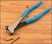
blank book! Studio Tips In
a class on Saturday, one student wanted to use a button with a shank on
the back to decorate her book, but didn't know how to deal with this big
bulge. In my experience these are easily (usually!) removed with a pair
of endcutters. Most contemporary buttons are plastic, even if they don't
look it! I also have a pair of cutters that my Dad would call sidecutters
which work almost as well. And they don't have to be large and expensive!
Don't forget to protect your eyes, the little
bits fly when they come off! I'd be delighted to receive your favourite tips for inclusion here - we can all learn from them and probably save someone - like me - frustrations! |
|
Gentle Thoughts
This piece was done with a Mitchell's Roundhand nib and
Higgins Eternal Ink. I lettered it a number of years ago before I was
really familiar with the Foundational Hand. The spacing in places is nasty....
Sorry. I originally saw the quote in Fred Salmon's studio and loved it.
(The piece was done by Valerie Elliott in the early 80's I think -in Neuland
- which means something to you if you're a calligrapher!) The Foundational hand is sometimes referred to as Roman Minuscule, Humanist Minuscule or English Caroline Minuscule. It is a bookhand, so legibility is important. We have a gentleman named Edward Johnston to thank for it. Johnston lived at the end of the Arts and Crafts movement of the 1800's and developed a passion for lettering. Living in Britain, he had easy access to many ancient manuscripts and studied them carefully. He was introduced to the Ramsey Psalter (Harley 2904) which was written in the south of Britain, probably Winchester, in the 10th Century. Johnston, thinking this to be an excellent hand, pared away some of the archaic traits to modernize and use it as a beginning hand for students. His book Writing & Illuminating & Lettering, published in 1906, is still available, but you will find little of his Foundational there, as that hand was not fully developed until about 1919. Another of Johnston's successes is the typeface he designed for the London Underground which is still in use today. The characteristics of this hand are: 35 degree pen angle, 4- 4.5 pen widths body height and vertical strokes, with emphasis on roundness ("Think Round!" is our mantra during Focus on Foundational classes!). In Vancouver, in June, I will be teaching Adding Funk to Your Foundational in which we will stray from the traditional and - well, stay tuned - I'll tell you more next month!
|
|
Teaching Schedule To get more details go to my website Calendar of Events page. Use the back button on your browser to return here. Mar 9 Burnaby
Artists Journal in a Day
Burnaby Comm. Ed. April 6 Victoria
Artists Journal in a Day
Fairbank Callig Soc - full April 13 Courtenay Instant Letters North Island College April 20 Victoria Instant
Letters Shoreline
Community School May 4 Port Alberni Spring Craft Fair P.A. Athletic Hall May 11,12 Calgary Artists
Journal in a Day Bow Valley Calligraphy
Guild May 25 Kelowna
Focus on Foundational Kelowna
Calligraphers Guild June 1 Vancouver Adding
Funk to Your Foundational* *I'll have more information about this class next month! |
For those of you who have taken the Coptic
Stitched Class, you may still acquire waxed linen thread from me.
It is $0.50/yard Cdn ($0.30/yard U.S. funds plus $2 for postage). Here is a list of the colours I currently have in stock:
It takes two yards of thread to complete the book as we made it. *Quietfire Design, Box 1231, Port Alberni, B.C. V9Y 7M1 Canada
|
|
If there is any information you would like to see in this newsletter,
let me know. Each month I will email you to let you know the new issue
is published. If you know someone who would like to receive notice of
byhand, just have them email me and I
will put them on the list. Bye for now and thanks for visiting! suzanne@quietfiredesign.com |
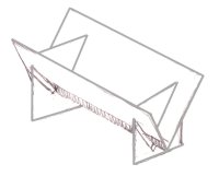
I have put together some sewing cradles for sale as some of you have been asking for them. They are not things of great beauty, but really, really handy for when you have a lot of holes to pierce. They are large enough for an 8.5" spine length and are $20Cdn (or $15US -new price!- to the States) shipping included. Email me if you can't live without one! I will try to bring these to classes so you can see them in person!
|
|
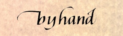
The original title lettering of byhand was done with a Mitchell's Roundhand Nib, size 0, and Higgins Eternal Ink. |
|