 |
|
October
2002 - Issue 17
|
|
Welcome! Especially to our new subscribers! While I was working on this issue I was reminded of being a high school student and writing reports. This issue is a bit of a departure from usual (whatever usual is!) and is mostly about my experiences at Artwerx and a report of a wonderful round robin I was involved in. I hope you'll allow me my indulgence! Farther down the issue is an article on how I mangled a piece of copper, and your monthly history lesson. And I am developing the most amazing teaching schedule for the new year. A description of the new workshop, the Pipe Organ Binding, which I am teaching at the Paperworks Gallery this weekend is up on the classes page. (Sorry, it's full!) And I finally have the photos for the Heritage Album up on the classes page, too! Sorry for the delay! The Alphabet Tag Swap II has been swapped out and you will be seeing those over the next several months in this newsletter. And twenty-two artists are heating up their work spaces as they create tags for the Season's Swap due October 31! Stay tuned! Once again I'd like to direct you to the Summer Doodle Challenge entries on the Subscriber's Gallery Page. You may not have seen the ones that arrived later. What wonderful variety! Thanks for the inspiration! Last time I was in Vancouver staying with my friend Susan, I thought I would see what my newsletter looked like on her monitor. They don't have fast internet and I was shocked to see how long it took for this newsletter to load. My apologies for that! I do pare down my graphics to 72 (or 75) dpi which makes them load faster, but you may find this one even slower than normal. I have spent all day scanning things to show you! I hope you enjoy this issue of byhand!
|
Important links at your fingertips! Back Issues of byhand How to subscribe and other stuff! If you wish to contact me, my email address is: suzanne@quietfiredesign.com To subscribe: send me an email
saying 'subscribe'!
Please feel free to browse through my
website |
|
Gentle Thoughts
|
|
Alphabet Tag Swap I &II Well I have to hang my head in shame because I neglected
to post two of the tags from Part I of the Alphabet Tag Swap - my humble
apologies to both these artists, who did wonderful jobs on their tags!
(Maybe that's why Jennifer hasn't called me back about lunch.... kidding,
Jennifer!) Part I
From this mistake, you'd think I'd learn to post these in order, but, Oh, No, not me...... Part II A smaller group of us decided that we would like to finish the alphabet, so I assigned the last few letters and we were off to creating! If you're interested in the background of this swap click here to read what we did!
Joan Byers - Mine was pretty straight forward once I decided on what to do. The original idea of a zeppelin came from Graeme Base's Animalia, zebra is the first thing that comes to mind when I got the letter "z", and to make it personal, it had to have a zucchini - what else grows well in all our gardens? I had them copied, multiples onto one page and assembled. The hardest part is always coming up with the idea.
(swap hostess note - I had a problem untangling them....)
ARTwerx 2002ARTwerx was a convention for creative individuals interested in artistic challenge and growth. Lazar Studiowerx Inc., together with ART Season, brought high-caliber artists and instructors to Vancouver over three days in September. My heartfelt thanks to Christina Lazar-Schuler for her hard work and dedication in organizing this event. As a calligrapher, I was used to working in gouache and watercolour on fine art papers. These classes were quite the departure from that! I had soooo much fun playing. I have included some of the art work I did in the classes - but please don't be too judgmental! This was done in a workshop environment and not in the safety of my own home where the garbage can is not far away.... 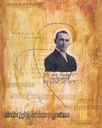 This piece was done in Claudine Hellmuth's class and includes, as a background element, a copy of a letter sent to my Grandfather (pictured above) in 1910. Friday, September 13, 2002 A Pocket Book of Paper and Metal Dreams with Nina BagleyThe first thing you notice about Nina is her fabulous raven hair, but as soon as she speaks, it's the southern belle accent that steals your attention. Nina (pronounced Nine-ah) is a jewelry maker and as she puts it "In the early winter of 1999, I opened a blank book one bitterly cold night and let my sense of design spill across the pages". To see her work more clearly, you must go to her website. The book she taught us combines her visions of paper dreams with those of her metal work. We basically made a book of pockets - but it was unlike any book you've ever seen before. We chose vintage disposed books and carefully cut out the book block. Then, using copper mesh, we constructed pockets which were metal on one side and acetate on the other. Prior to constructing the pockets, we immersed the metal in a solution of Liver of Sulphur. We were the stinkiest and noisiest class a ARTwerx and proud of it! The noise was the tapping of the class hammering holes and eyelets to construct the pockets. This day was just the beginning of the book. Looking at Nina's books, you can tell there have been many, many days of work incorporated into each one. The embellishing of this book will be a long term labour of love. I will think of my wonderful day with an amazing individual whenever I handle this book. Thank you, Nina, for helping me work outside the box!
Nina's demonstrations
Saturday, September 14, 2002 Revel in the Unexpected with Claudine HellmuthClaudine is a petite powerhouse that uses her fine arts background
and joy of teaching for a winning combination. She is well organized,
enthusiastic and down to earth. Did I mention talent?
Two pieces of my artwork (both 5" x 7") made in Claudine's class. |
|||||||||||||
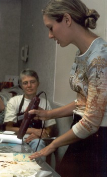 |
Claudine demonstrating techniques for aging your surface |
||||||||||||
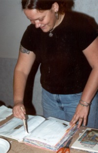 |
Sunday September 15, 2002 A Pocket Full of Grace with Karen Michel"There are no rules, just fun!" This was a sentence in Karen's description of her workshop and it's really true! Well, at least the fun part is. Perhaps we don't want to know about the rules.... Look at the big smile on Karen's face. For someone with a fine arts background,
I don't expect them to have this much fun. This was all about altering
books. You can see many fine examples of Karen's altered pages on her
website. And what we saw at
the workshop is just a tip of the iceberg. I think that maybe if I stick around with these artists that do such good compositions, someday it will rub off on me! This workshop was the last of three intensive days, and we all became rather distracted at the end! Thanks to Karen, who is just the sweetest person, for her patience and inspiration and for teaching me how to work with new toys. Her influence will last long after the workshop ended. |
||||
|
|
|||||
|
|||||
The FLat Salon Sister's World Tour 2002 - Part II |
|
|
Many of you either know about or have
met my Flat Salon Sisters. |
|
The Travels of Flat Suzanne
Here's a picture of Flat Suzanne with Buddy, Leslie's dog. Buddy took a liking to Flat Suzanne until she realized that he was a bit of a chewer! |
|
|
(....in my dreams......) |
Flat Suzanne took so long getting to Colorado, Leslie was sure that she'd taken a detour to straighten things out at the Winter Olympics. I guess she was right, as this is what was in Flat Suzanne's journal after her visit with Leslie! (although I don't recall seeing that cover of TIME...) |
|
While Suzanne was frolicking at the Winter Olympics, Flat Kelley arrived. Fluffy Suzanne toured her all over town, to her calligraphy class, to the tourist information center, to coffee morning with the Stitch and B*tch group, and for scenic views of Mt. Arrowsmith... |
|
|
It must have been hard to be hostess to someone who'd been to the Olympics, but Ar did take Flat Suzanne to the Academy Awards!
(I want that kitty....) |
|
|
Photo of Flat Suzanne with Buffalo Bill Cody. He staged the first rodeo ever in North Platte, NE Whew. Be still my heart. |
|
Heidi writes how wet a spring they were having. I know that really cramps outdoor activities for Flat people... Flat Linda and Flat Suzanne were traveling together by this time, as you can see from the photo. |
|
|
This was the first place that the pets complained about her! Linda took Flat Suzanne and Flat Leslie to visit San Xavier Mission which is the oldest Catholic Church in continual use since 1793. It's recently had a big restoration. The one tower was never finished to avoid the huge taxes on finished buildings!
On another trip Flat Suzanne was stuck on a Saguaro skeleton for a photo op..... |
|
|
|
|
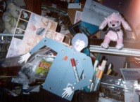
Flat Leslie, Flat Kelley and Flat Suzanne all together! Party time! |
 |
|
And so ends the travels of Flat
Suzanne, who was allowed into the lives and hearts of this wonder group
of Sisters! Thank you all so much.
Flat Suzanne left home Feb 7 and returned home safely in mid-August having traveled many miles (and kilometres, too!). I have enjoyed this round robin immensely, had many smiles and some outright belly laughs. And I've even learned some geography and history to boot! |
|
|
Meanwhile back on the Westcoast
of Canada.... What is Leslie doing???
This one didn't get away! |
|
|
Flat Leslie goes to Artwerx!
...and Fluffy Suzanne has another photo of Flat Leslie with her Stitch and B*tch group, but they were really naughty and I just can't post that on the web! But I think Flat Leslie is getting a bit homesick, so perhaps it's time to say Goodbye. That will be a very sad day indeed. |
|
My Passion for Copper Well, really, who can resist copper? It comes in sheets and rolls, and a variety of weights; if it's lighter weight, you can cut it with an old pair of scissors, emboss it with a stylus or run it through a paper crimper. You can hold it with a pair of tongs or tweezers, place it in a flame and change it's colour. But one of the things I most love to do with it is to tarnish it.
Well, since I now have these rubber stamps, I thought, hmmm, how can I get the image on the copper, and keep it copper coloured and patina all around it? Here's what I did for the tile you see to the left. I cut a piece of copper 2" x 2". I inked my stamp with embossing ink, stamped in the middle of the piece of copper, and quickly sprinkled clear embossing powder over the stamped words. I brushed away stray particles of embossing powder with a soft brush and embossed the letters with my heat gun. I allowed the copper to cool then added a few drops of Modern Options Patina Green and a few drops of Patina Blue and waited. The picture you see is actually not as good as the real thing. I was really pleased with my experiment. I want to make a pin out of one, and the other is wired into the book I made in Nina Bagley's class at Artwerx. I have added patina to cut out copper hearts and then used acrylic medium to seal them. (These were for cards and I didn't want the copper to be flaking everywhere.) But the item looks like it's been sealed when you top it with acrylic. Perhaps a spray sealer would give a more natural look. Stay tuned - next month I'll tell you about other copper treatments... |
|
Waxed Linen Thread Prices: It is $0.50/yard Cdn ($0.30/yard U.S. funds) plus $2 for postage and handling .
Here is a list of the colours I currently have in stock:
For those of you who have taken the Coptic Stitched Class, it takes two yards of thread to complete the book as we made it. For those of you who have taken the Criss Cross Coptic, you will require five yards per book. |
|||||||||||||||||||
|
I have put together some sewing cradles for sale as some of you have been asking for them. They are not things of great beauty, but really, really handy for when you have a lot of holes to pierce. The legs come off so they're perfect for going to classes. They are large enough for an 8.5" spine length and are $20Cdn (or $15US - to the States) shipping included. Email me if you can't live without one! I will try to bring these to classes so you can see them in person!
|
Brass Corners As well as the waxed linen, I now have some brass corners (the 3rd one down is Nickel or silver coloured) which are 50 cents Canadian (or U$0.35) each. They fit nicely on a bookboard of about 2.2mm thickness covered with decorative paper. Email me if you are interested - I don't think shipping will be too much, but that depends on the quantity! 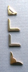 |
||||||||||||||||||
brace
yourselves...History LessonHere is the fifth installment of the information panels from my exhibition, Lines of Evolution.... Gothic12th - 15th centuries
|
|
Teaching Schedule
|
|||||||||||||||||||||||||||||||||||||||||||||||||||||||||
|
If there is any information you would like to see in this newsletter,
let me know. Each month I will email you to let you know the new issue
is published. If you know someone who would like to receive notice of
byhand, just have them email me and I
will put them on the list. Bye for now and thanks for visiting! suzanne@quietfiredesign.com |
|
|
The original title lettering of byhand was done with a Mitchell's Roundhand Nib, size 0, and Higgins Eternal Ink. Quietfire Design Rubber stamps were used to create the other designs. |