|
|
|
December
2002 - Issue 19
|
|
Gentle Thoughts
|
Season's Greetings!Welcome to the new subscribers. It's nice to have you with us. The more, the merrier! I have a few little corrections and additions to last month's byhand: Pat Muller reports it is the Goodwill (not the Salvation Army!) that has sweaters for $0.99 on Mondays in the States. (This is from the Studio tips section last month) And I have to say... Pat is very good at sharing. The other day a roll of previously undetected purple yarn (Pat's favourite colour) popped out of my tote bag and rolled across the floor (much to kitty's pleasure)... Don't forget to check out the recent Class Photos pages. See if your smiling face is there and your fabulous books!
And there are some new photos in the Stamping Gallery. Don't forget if you're proud of artwork that you have stamped with a Quietfire Rubber Stamp, please send me a scan and I'll be delighted to put in the Stamping Gallery And note that after I sent out last month's byhand announcement, I discovered Nina Bagley's workshop in Montreal has been postponed to May. Also check out Nina's exquisite books and article in the current issue of Somerset Studio. What I have been up to...
Altered Quilt Block Swap II New to Quietfire Design!Here's the long and the short of
it all. We have eyelets!
This requires a whole bunch of eyelets! and there will be more information about it in the next issue of byhand. Check out the new colours of Waxed
Linen Thread. We now have Country Red, Denim and Lavender in
stock. I hope you enjoy this issue of byhand!
|
Important links at your fingertips! Back Issues of byhand How to subscribe and other stuff! If you wish to contact me, my email address is: suzanne@quietfiredesign.com To subscribe: send me an email
saying 'subscribe'!
Please feel free to browse through my
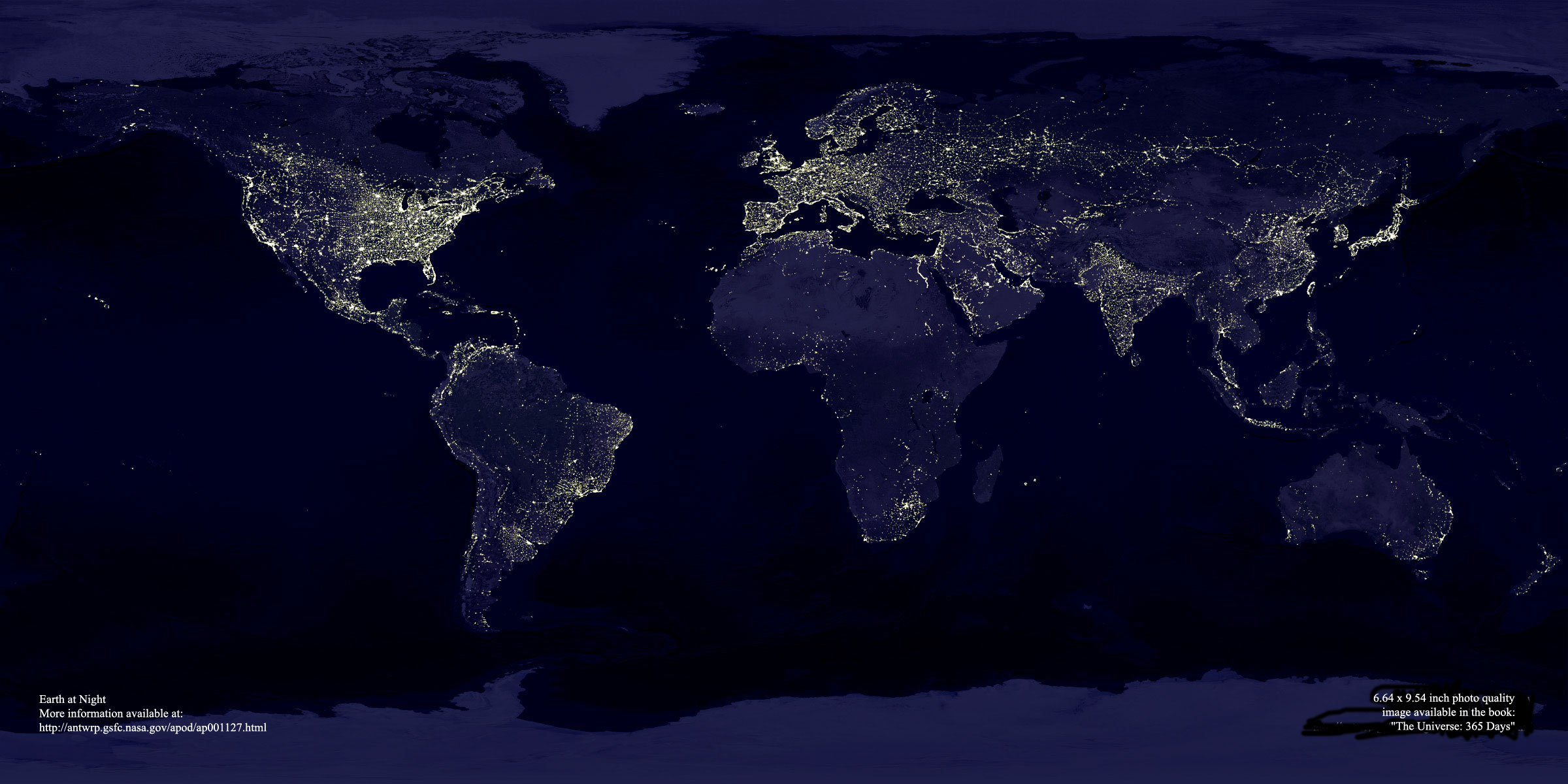
website Site Siting Anne Atkinson sent me this website: Women in Greek Myths And a friend of my Mom tipped me off to this site which has nothing to do with art, but I thought it was really cool - I suppose it's a Santa view of the earth. Check it out on NASA's site.
The Journals of Susanna Moodie by Margaret Atwood. Now, most Canadians will know this name well. And since she won the Booker Prize in 2000, I guess she is even better known! I love Margaret Atwood's poetry (and I'm not really a poetry person). I have used it many times in calligraphic pieces. The Journals of Susanna Moodie was first published in 1970, so it's not new, except to me... It begins this way.. I take
this picture of myself Now it is more accurate: where my eyes were, The thing that struck me about this book is the cover and illustrations. My copy is (ahem, overdue) from the library and is different from the copies they have at Chapters.com. All the collages where done by Margaret Atwood and they're wonderful! Atwood writes in her Afterword about Susanna Moodie, who was the author of several books: Roughing It in the Bush and Life in the Clearings. The Afterword is just as interesting as Atwood's poetry. The copy I have here is a scant 64 pages and is certainly worth a request from the library. I'm kinda sorry I have to return it!
|
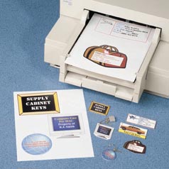
Studio TipsThis is a great idea from Gloria at Write
On! Office Solutions here in Port Alberni. I practically had to go tie
her down to get this description as she is so busy these days! Last year Gloria made key tags with photos of her son on them for Christmas presents using Shrink Plastic for inkjet printers. She didn't use any fancy computer programs, just Word, creating the artwork as follows: (Each tag takes about half of an 8 1/2 x 11" sheet of shrink plastic.)
What grandparent can resist carrying a photo of their grandkidlet around? Thanks Gloria! for sharing! Here's the "technical" information on the Shrink Sheets:
I'd be delighted to receive your favourite tips for inclusion here - we can all learn from them and probably save someone - like me - frustrations! |
New ChallengeSo I had this idea for another swap. Still using tags - not due till mid February - so you have lots of time to think about it.... (and no excuse for those of you in Edmonton and Red Deer as I can pick them up in person!) Here's the
challenge.
The one on the left is from Charmers II and the one on the right is from a minibook swap I did with the CNDjournalarts group. The one on the right is an accordion book with content. The one on the left is full of Post-its! Your imagination is the limit! You may use any size tag. You may use the tag for the cover, you may use tags for the pages as well (or not). The books can be blank, but it'd be reallllly fun if they had content - but I don't want to discourage anyone from playing by overwhelming them. Tag Book SwapI will be delighted to sign you up anytime till December 10. You will receive more instructions in private emails. You may make as few as 5 books or as many as there are players. You will make your books and send them to me with a self-addressed stamped envelope.You will not receive your own book back. Ooooo, this should be some serious fun! |
|
Alphabet Tag Swap II Here is the last installment of the Alphabet Tag Swap.
It was a wonderful swap and I would again like to thank everyone who
participated!
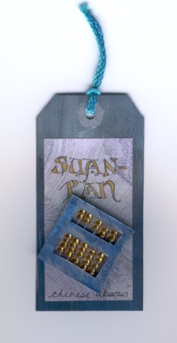
Letter 'S' Brought to you by Suzy-q e. Suan Pan what is it? Well I never heard of it until this year. Well, I had, but not by this name. We are all familiar with the Abacus; this is the Chinese Abacus, called a Suan Pan. How I came up with this involved my new passion (I know, I know, more supplies and more retail therapy ie. Spending) glass beadmaking. I was involved in an exhibition of glassbeads by Canadian beadmakers. Since I am not a jewelry designer/maker and I am a beginner I choose a simple bead and put my brothers beautiful woodwork around it, resulting in a Chinese Abacus. Now for the tag. Making a small abacus presented the only problem (except design of course). The tag was covered in multiple blue acrylics mixed together slightly and then a dry brush layer of iridescent silver very lightly. The purple paper is a color copy of some paste paper I had made and the lettering was with the gel pens. The little abacus was cut from foam core and painted the same as the tags but with more of the dry brushed silver on top for a metallic look. The beads are store bought 'E' beads. Straight pins were used to make the rods for the beads to run up and down on. I added a little glue at the bottom of these rods for safety. Hope you enjoyed my tag.
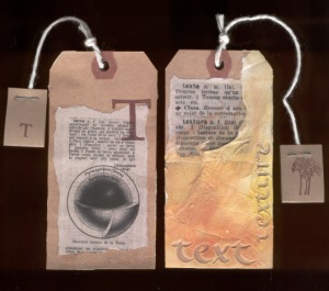
Those of you who have taken my Artist's Journal class will know that I love spackle (or drywall compound)! So, I immediately thought of text and texture. I found both words in an old French-English dictionary that I had, so copied those to fit on the front part of the tag. The copy was glued on the front and the spackle spread over it and the letters made with a Mitchell Roundhand nib into the wet spackle. After the spackle dried, I added watercolour to the surface. On the back, more French. The tag was completed with a string which was trying to look like a teabag string (didja get it, huh, huh?) ending with a folded and stapled tag with a stamped tree on one side and a "T" on the other side!
When I was first assigned the "?", I thought about writing the definition of a "?", but instead thought that doing the "W5" would be more interesting. After the first round, I was perplex as what to do with all the lovely artwork, so I decided to created something that could be useful. I created the "Who? When? Why? Where? How?" on the computer and pasted then on the tiny tags. Once the glue had set and the water colour backwash was completed, I thought I would have fun with my stamp and embossing powder and embossed the star. With some glitter glue I continued to decorate the tag with the theme "?". The Tags where later laminated for protection and the magnet glued securely. Now everyone can enjoy their new fridge magnet.
The background of the tag is done with a Color Box Pigment Ink Option Pad by removing a few of the green colors and stamping the pads directly on the tag. The lower case Italic "g" was written with a 3.5 Zig calligraphy felt pen. The Twinnings Green Tea & Lemon tag is attached under gold sealing wax stamped with a metal heart seal and under a little green "grenouille" which means frog in French! Some of you got a leaping frog and others a sedate frog! The tag is finished off with either gold cord or green ribbon as I didn't have enough of either to do all of the tags with the same material. Once again a fun project. Thanks Suzanne! |
brace
yourselves...History LessonHere is the seventh installment of the information panels from my exhibition, Lines of Evolution.... Copperplate
Some calligraphers would say that the beginning of the Copperplate era (17th - 19th centuries) was the end of calligraphy. Copperplate is completely different from the other hands discussed here as it was lettered with a pointed nib, not the broad edge. Copperplate dominated English formal writing for almost 300 years. Although it appears to be a cursive handwriting style it is closer to formal lettering in its demands of uniformity and manipulations. The thicks and thins of the letters are produced by pressure, requiring a sensitive touch to give them elegance. The supremacy of the quill pen over many, many centuries was coming to a close. Metal pens had been dabbled with, but it was not until the early 19th century that the technology was available for production and with so many more literate people the need was there, too. Ancient recipes for inks were not compatible with the new steel pens, as they were made of corrosive materials and even the important carbon inks (which are lightfast) would clog the pens, so alternatives had to be developed. The modern age had arrived and calligraphy as it had been for centuries was changed. |
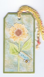
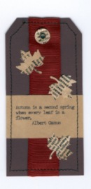
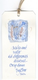
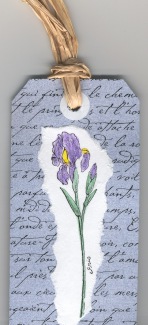
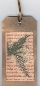
Seasons Tag SwapWe had 22 players in this swap! A big Thanks! to everyone who played.
We hope you enjoy our artwork! |
|||
|
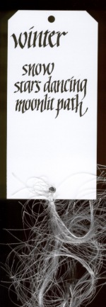
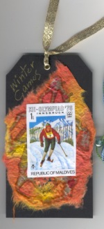
Dee Rad (ed. note - so this is winter in Hawaii?.... Sigh!) |
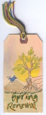
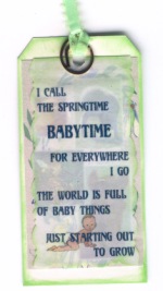
Dorothy Baynes This was Dorothy's first swap and she said it was a little tough thinking about spring while it was snowing....! |
Connie Kleckner This quote is stamped in gold on the back of Connie's tag: More
than anything Claude Monet |
Janice Rusnak Janice just recently bought a new sewing machine - I'd say she had quite a bit of fun! |
|
Christiane Lenz |
Veronica Goff |
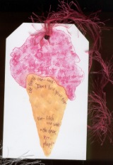
Joan Byers Five
little ice cream cones so good to eat |
Corinne Pratz (ed. note - All of Corinne's tags were completely different!) |
|
Ginny Porter
|
Lorna Long (ed. note - this is Lorna's first tag, she did two complete sets of different designs). She writes "(this) is actually a book mark. I used the clipiola's for that reason. One of the things I found was that shipping tags don't normally make good book marks as the pages catch on the edge of the card around the hole in the tag (?? follow that?) Anyhow that is why I had to add the thick paint on the back. Later I thought of adding a stem and leaves to create a spring blossom - but that was later. They weren't as successful as using the clips on card stock."
|
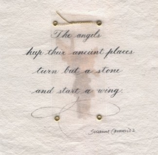
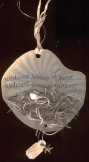
Suzanne Cannon I have to tell you
a bit about the tag shape. When I worked for the Geological Survey of
Canada, I had access to these great fossils. Well, between that and
the purchase of some PenScore, I made a
fantastic impression of a Late Cretaceous ammonite. (I think the sample
was from the Queen Charlotte Islands off the northern coast of B.C.)
I do have to apologize for the tropical shell. Ahem. I didn't have any
tiny local shells..... |
Anne Atkinson (ed. note - many of Anne's tags were completely different)
|
|
My
Passion for Copper - Part III Several years ago now, I had an exhibition of calligraphy at the Rollin Art Centre in Port Alberni, B.C. I had just read about a technique for etching copper, and just knew that I could do it. If you don't like using chemicals, you won't like this project! Basically, you are using a chemical to eat away the copper all around the image you wish to keep. In this case it was the logo of the exhibition.
To do this, you will need
I used the copper I had bought in sheet form that is 0.0095" (twice the thickness of the Lee Valley plant tags) and cut a piece with tin snips that was approximately 5 x 3 1/2". I put clear packing tape all over the back (if you don't the chemical will eat through the whole sheet of copper!). Clean the surface of the copper before applying your image. To get your image on the copper you have some choices, you can stamp onto the copper using a permanent black stamp for ink, or use a Sharpie felt pen to draw a design. Allow them to dry. For Lines of Evolution, I did a copy transfer using acetone. Wear gloves and
eye protection whenever you deal with chemicals! When you are ready, pour the Etchant solution into the shallow plastic container. Make sure the copper is suspended and the surface is submerged. I returned every 15 minutes to gently stir the bath and after two hours, removed the plate from the bath and rinsed it generously with tap water into the sink. A little scrubbing removed the black where the image was. Amazing. Isn't chemistry wonderful?! The chemical in the Etchant is Ferric Chloride. Other chemicals that etch copper are: Ammonium Persulphate and Sodium Persulphate (and this information comes from internet research, not personal experience!) Ammonium Chloride and Copper Sulphate are some of the ingredients used in the Patina solutions I have mentioned before. Obviously Copper doesn't like the chlorides and sulphates - but I like what they do to the copper!! Stay tuned - next month we'll do other copper treatments... |
Just a little note about these items I have for sale.I really don't want to charge you a whole lot for shipping. That's the beauty of no shopping cart (which automatically calculates your shipping). There's nothing worse than making purchases that you know will fit in a little envelope and paying $10 plus for shipping! So, if you decide to combine the items below, and it doesn't add up to very much weight, you don't have to pay a lot of extra shipping. Please feel free to email me for more information! I'm delighted to help you create beautiful things. Shipping for most items will be $2 within Canada and
US$2 to the United States. You may wish to email me to check for availability! Send me your list and I will try to unravel the mysteries of Canada Post guidelines!! Please
make your cheques payable in Canadian or U$ funds to Suzanne
Cannon. |
Waxed Linen ThreadPrices: It is $0.50/yard
Cdn ($0.30/yard U.S. funds).
For those of you who have taken the Coptic Stitched Class, it takes two yards of thread to complete the book as we made it. For those of you who have taken the Criss Cross Coptic, you will require five yards per book. |
|||||||||||||||||||
|
$8.50 each |
||||||||||||||||||
|
I have put together some Book Cradles for sale as some of you have been asking for them. They are not things of great beauty, but really, really handy for when you have a lot of holes to pierce. The legs come off so they're perfect for going to classes. They are large enough for an 8.5" spine length and are $18Cdn (or $12US - to the States). I will try to bring these to classes so you can see them in person!
|
Jazz up your book covers with metal corners! |
||||||||||||||||||
|
Suzanne's Schedule
|
|||||||||||||||||||||||||||||||||||||||||||||||||
|
If there is any information you would like to see in this newsletter,
let me know. Each month I will email you to let you know the new issue
is published. If you know someone who would like to receive notice of
byhand, just have them email me and I
will put them on the list. Bye for now and thanks for visiting! suzanne@quietfiredesign.com |
|
|
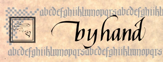
The original title lettering of byhand was done with a Mitchell's Roundhand Nib, size 0, and Higgins Eternal Ink. Quietfire Design Rubber stamps were used to create the other designs. |


 White
Printable Shrink Sheets Create personalized key chains and luggage tags
with vibrant, waterproof colors. Use any software to design, then simply
print, cut and bake. Designs shrink to 1/5 their original size, then harden
and thicken while cooling. Sheets feed easily through any inkjet printer.
4 Sheets per Pack 8-1/2 x 11
White
Printable Shrink Sheets Create personalized key chains and luggage tags
with vibrant, waterproof colors. Use any software to design, then simply
print, cut and bake. Designs shrink to 1/5 their original size, then harden
and thicken while cooling. Sheets feed easily through any inkjet printer.
4 Sheets per Pack 8-1/2 x 11
 Susan
Ewart -
Susan
Ewart -
 Suzanne
Cannon -
Suzanne
Cannon -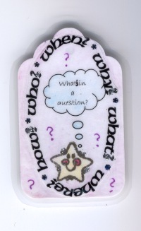 Karin
Fung -
Karin
Fung - 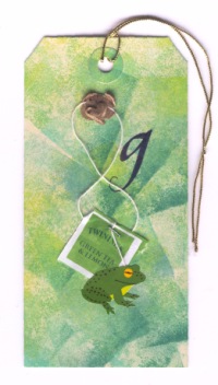 Kathy
Guthrie -
Kathy
Guthrie -
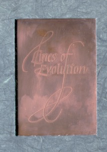 This
image really did not scan well. The copper plate is mounted in the front
cover of my exhibition catalogue (the one and only exhibition catalogue!)
and the cover paper is a dark green - it looks grey here and I couldn't
seem to solve the problem....
This
image really did not scan well. The copper plate is mounted in the front
cover of my exhibition catalogue (the one and only exhibition catalogue!)
and the cover paper is a dark green - it looks grey here and I couldn't
seem to solve the problem....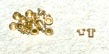 The eyelets!
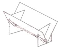
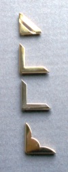 Book
Corners
Book
Corners 