|
|
|
November
2002 - Issue 18
|
|
Oprah Winfrey believes the definition of luck is preparation plus opportunity. I'd like to think she's right, as this month I celebrate the beginnings of a most interesting association... Quietfire Design is pleased to announce that an exclusive
line of their hand-bound books will now be available through the Write
On! Business Solutions e-commerce corporate gift site.
Sweet
Solutions was borne out of Write On! Business Solutions
Ltd., a premier office and business product supply company in the city
of Port Alberni on Vancouver Island, British Columbia. Corporate Gifts
has been an item Write On! Business Solutions had been asked to provide
to their customers time and again. Searching for the 'write' quality product
took Write On! to local chocolatiers Len and Chris Readshaw, and to Quietfire
Design. I don't know. I still think I'm just plain lucky.... |
|
Well, thanks for indulging me that little news flash! It's been very exciting and the little elves (I wish....) at the studio are busy, busy, as it's craft fair season, too. Welcome to Issue 18 of byhand! And welcome to new subscribers! This issue of byhand is a bit shorter than recent issues, but I think you'll be fine with that....(no yawning permitted) You know, I'm going to test each of you when I see you on the contents of past issues of byhand..... kidding! I'd just like to mention that if you have subscribed to byhand and you are not receiving your notification email, I regularly have emails bouncing back at me! Perhaps some servers think I am spamming.... No, officer, really, I'm a nice girl..... I know that sometimes Hotmail accounts are full and I will get emails back. It's quite the learning experience I am having. I usually try to send the email twice, if it's unsuccessful the first time. Don't forget to check out the recent Class Photos pages. See if your smiling face is there and you fabulous books!
The Heritage Album class is coming up in Burnaby later this month. Contact Burnaby Community Education to register (604) 664-8888. There was still 3 spaces available when I wrote this. It's craft fair season - come on out and get some creative ideas. And if you're at the fairs that I am attending, please grab me a cup of coffee! (Milk instead of cream....) I will gladly pay you Tuesday..... Now, if there is some way you could go to the ladies room for me..... Don't forget if you're proud of artwork that you have stamped with a Quietfire Rubber Stamp, please send me a scan and I'll be delighted to put in the Stamping Gallery. I hope you enjoy this issue of byhand! An Unexpected Find
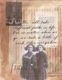
Many of you will recall this artwork from the July/August
issue of byhand. When I designed this piece I decided to add this
wonderful photo of the women which I had acquired in an old photo swap.
I had no idea where the photo was from and hoped the person who sent it
wouldn't be mad that I used it so publicly! BamaJoyce wrote: Joyce goes on the say that the girls' parents were both French Canadian but emigrated to Marinette, Wisconsin, where all of their children were born and raised. Although Joyce never met Gertrude, she knows she married, had children and grandchildren. Joyce learned of Leona and Gertrude when her grandmother died and looked in her address book. Joyce met Leona in 1975 when her family visited her in Worcester, Mass. She says she still had the same sweet face she showed in that early photo. At that time Leona was celebrating 75 years as a nun. Leona had entered the convent in Montreal at thirteen and the photo was taken when she had returned home due to illness at about the age of 18. Leona returned and taught 5th grade on the Canadian/American border for 44 years. My thanks to Joyce for writing to me and sharing the history of Gertrude and Leona. I will never look at this piece the same way again! Those two young women weren't just friends - they were sisters!
|
Important links at your fingertips! Back Issues of byhand How to subscribe and other stuff! If you wish to contact me, my email address is: suzanne@quietfiredesign.com To subscribe: send me an email
saying 'subscribe'!
Please feel free to browse through my
website Site Siting If you are in the Montreal area, you have fantastic opportunities to work with internationally renown instructors. Check out Carole Segal Studio of Fine Art. Nina Bagley will be teaching her wonderful workshop A Pocket Full of Dreams there later this month. Don't miss it! It's worth being there just to see Nina's books! Newsflash - Nov. 12 - Nina informs me that her workshop has been moved to May! Nina is featured in the current issue of Somerset Studio. I just receive my issue today - oh, hey, I'm in that one, too! But you have to look hard....
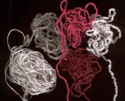
Byhand is delighted to be included in a new publication
by Kara Sjoblom. Kara has compiled a wonderful list of 'zines published
by women. Her book, entitled Studio Tips Thanks
to Pat Muller from Vancouver for this tip. Check it out - I think she has the touch! (this scan really doesn't do these fibres justice)
I'd be delighted to receive your favourite tips for inclusion here - we can all learn from them and probably save someone - like me - frustrations! |
Swap update and New ChallengeThe Seasons Swap is almost ready
for mailing as I write this. I will begin sharing them in next month's
byhand. Here's the challenge.
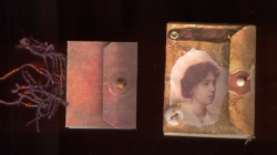
The one on the left is from Charmers II and the one on the right is from a minibook swap I did with the CNDjournalarts group. The one on the right is an accordion book with content. The one on the left is full of Post-its! Your imagination is the limit! Tag Book Swap |
|
Alphabet Tag Swap II If you're interested the background of this swap click here to read what we did! My scans just do not do justice to these tags! They are fabulous!
|
|
My Passion for Copper - Part II
Phil at Stephen's assured me that if I wanted to order any copper, it would have to be a sheet that was at least 3' x 8'. Now this is akin to a sheet of plywood. Okay. Let's see what else I can find out... Phil whipped out his gauge to check the thicknesses and realized that these samples were realllllly thin and went to get his micrometer. I had three samples with me. The piece taken from the roll and the Lee Valley Copper Plant Tag were the same thickness at 0.0045". Gee, that's thin. The other piece that had come flat was much(?) thicker at 0.0095".... Pieces of copper that are rolled are referred to as coils and that is probably how I would get it. (I think it might be easier to store than a 3x8' sheet of copper....) The samples you see in the scan are the thinner copper. The top tag is the Lee Valley Plant tag which I have used an embossing tool to impress lettering into (recognize the fibres, Pat?). An old ball point pen or end of a crochet hook will work, too. The heart was cut with a pair of scissors (not the sewing scissors....) and then put through a tube wringer (which is what I have instead of a paper crimper). The copper is really no thicker than a piece of cover stock, so you won't damage your crimper. Stay tuned - next month we'll do other copper treatments... |
|
Waxed Linen Thread Prices: It is $0.50/yard Cdn ($0.30/yard U.S. funds) plus $2 for postage and handling .
Here is a list of the colours I currently have in stock:
For those of you who have taken the Coptic Stitched Class, it takes two yards of thread to complete the book as we made it. For those of you who have taken the Criss Cross Coptic, you will require five yards per book. |
|||||||||||||||||||
|
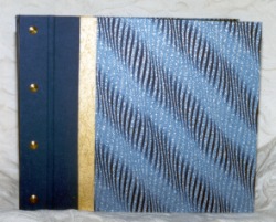
I have put together some sewing cradles for sale as some of you have been asking for them. They are not things of great beauty, but really, really handy for when you have a lot of holes to pierce. The legs come off so they're perfect for going to classes. They are large enough for an 8.5" spine length and are $20Cdn (or $15US - to the States) shipping included. Email me if you can't live without one! I will try to bring these to classes so you can see them in person!
|
Brass Corners As well as the waxed linen, I now have some brass corners (the 3rd one down is Nickel or silver coloured) which are 50 cents Canadian (or U$0.35) each. They fit nicely on a bookboard of about 2.2mm thickness covered with decorative paper. Email me if you are interested - I don't think shipping will be too much, but that depends on the quantity! 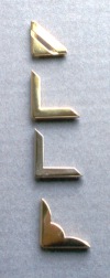 |
||||||||||||||||||
brace
yourselves...History LessonHere is the sixth installment of the information panels from my exhibition, Lines of Evolution.... Italic
After centuries of the rigid formality of the Gothic hands of the Middle Ages the Renaissance arrived, and the flourishing of the arts was reflected in the letterforms. The first Italic writing manual was published in 1522 by a Vatican scribe named Arrighi. The book was printed from wood blocks. Italic readily adapted itself to a cursive handwriting style. It is the hand of Michelangelo and Raphael. During this time Gutenberg invented movable type, and the printed book came of age. The role of the professional scribe changed from the lettering of books to book decoration and teaching the hand to wealthy individuals. In Germany, type design was based on the Gothic hands and remained that way for several more centuries. Italic is lettered at 5 pen widths and a 45 degree pen angle. |
|
Gentle Thoughts
|
|
Suzanne's Schedule
|
|||||||||||||||||||||||||||||||||||||||||||||||||
|
If there is any information you would like to see in this newsletter,
let me know. Each month I will email you to let you know the new issue
is published. If you know someone who would like to receive notice of
byhand, just have them email me and I
will put them on the list. Bye for now and thanks for visiting! suzanne@quietfiredesign.com |
|
|
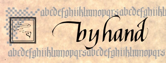
The original title lettering of byhand was done with a Mitchell's Roundhand Nib, size 0, and Higgins Eternal Ink. Quietfire Design Rubber stamps were used to create the other designs. |


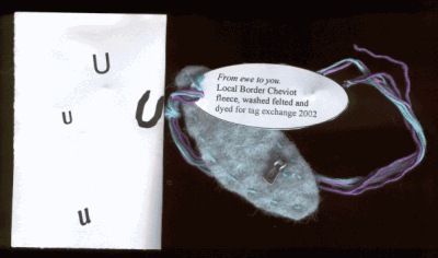 Charmaine Hamilton -
did not want to do the usual rectangular tag - so decided on the oval
shape. I had tons of fleece, so wanted to incorporate it. The rest was
easy - I love the letter "U" but had not considered doing the 'play
on words' until it was finished. The dyeing, carding and felting were
easy, I had trouble with the concept of how to decorate it, plus I wanted
the other players to understand which letter I had been designated.
So I chose the metal charms (could not get 13 identical!) and added
the envelope.
Charmaine Hamilton -
did not want to do the usual rectangular tag - so decided on the oval
shape. I had tons of fleece, so wanted to incorporate it. The rest was
easy - I love the letter "U" but had not considered doing the 'play
on words' until it was finished. The dyeing, carding and felting were
easy, I had trouble with the concept of how to decorate it, plus I wanted
the other players to understand which letter I had been designated.
So I chose the metal charms (could not get 13 identical!) and added
the envelope.
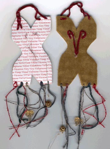 Marion Dodds
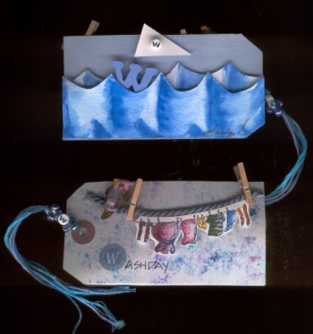 Marilyn
Smitshoek
Marilyn
Smitshoek 
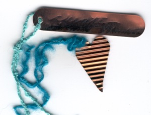 I
did a little research the other day on copper. I have bought copper rolled
in a tube and flat in a package. I was curious about the thickness and
about availability. Now, one of the good things about living in Port Alberni
is that it has a lot of industry (mostly foresty-type stuff, but fishing,
too), and there are businesses that service these industries. So, off
I go with my little samples of copper to Stephen's Sheet Metal. They must
roll their eyes when they see me....
I
did a little research the other day on copper. I have bought copper rolled
in a tube and flat in a package. I was curious about the thickness and
about availability. Now, one of the good things about living in Port Alberni
is that it has a lot of industry (mostly foresty-type stuff, but fishing,
too), and there are businesses that service these industries. So, off
I go with my little samples of copper to Stephen's Sheet Metal. They must
roll their eyes when they see me....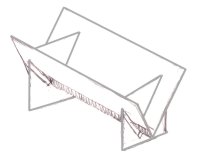
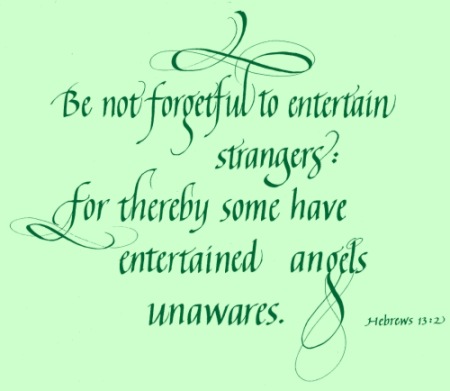
 When
most people think of calligraphy, they think of Italic. Its elegant and
flowing lines seduce the eye. To the calligrapher, its versatility is
unparalleled. Although not the easiest hand for a beginner, it cannot
be resisted.
When
most people think of calligraphy, they think of Italic. Its elegant and
flowing lines seduce the eye. To the calligrapher, its versatility is
unparalleled. Although not the easiest hand for a beginner, it cannot
be resisted.