|
|
|
May
2002 - Issue 13
|
|
Welcome to all the new subscribers! This seems to be a huge issue of byhand. I hope you enjoy it! If you are in the Port Alberni area this weekend, please drop in to visit me at the Giant Spring Craft Fair. I'll only be there on Saturday, though, patiently waiting for some kind soul to bring me a cup of coffee (milk instead of cream, please!), which I know I'll desperately need! I will have some mounted Quietfire rubber stamps for sale. I'd love to see you there! May is a busy travel month for me. I am delighted to be going to both Calgary and Kelowna to teach classes, and I look forward to meeting lots of creative people! The Artist's Journal class is full, but I know there are still some spaces in the Coptic Hardcover Journal Class should you be in Calgary on May 13th. And.
Don't forget
to check out the new The DrawIf you are new to byhand,
you may have missed our decorated postcard draw for a Please
Click here to go to the newly formed LIZARD! Congratulations! And many thanks to all those who sent in their delightful decorated postcards. Click here to see current offerings of Quietfire Rubber Stamps!
Alphabet Tag Swap Here
is some more offerings from our alphabet tag swap. If you'd like to know
more about the swap,
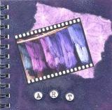
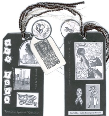
Kim Sickler Kim was our lone American participant - Bravo, Kim! We loved having you play. I've noticed from other things I've seen of Kim's that she enjoys adding a little quirky surprise into her art - just check out Mr. "Neuvo Nerdo" (he's upside down on the left)! Here's what Kim wrote: When you assigned me the letter N nothing came to mind right away so I made it a point to think about this letter N for a time. Nothing would come to mind except "New York". So, I made my tag around the theme of New York. I also wanted to keep to a black and white color combo. I made the black tag; stamped my New York images in black onto white paper. Never can leave the tag backs plain so carried the theme to the back of the tag as well. Had to give tribute to Sept. 11th 2001 for that memory will remain in me for the rest of my life. Up until this time, I did not produce any art about Sept 11th for a keepsake of my own idea. Guess the New York theme and what is behind it kept me stuck to black and white. This piece of art stirred up alot of emotion and sadness in me for our country will not be the same because of this tragedy. This was definitely a time to heal for me. The next tag had the letter N from a beautiful Stampsmith alphabet. The round tag I just could not resist! LOL I love to use Mr. "Neuvo Nerdo" with his moveable eyes whenever I can! That came together at the last step in the process. The black, white and silver fibers and the silver Krylon pen brought the whole piece together. Enjoyed the whole process of this tag and cannot wait 'til we begin to work on the other letters.
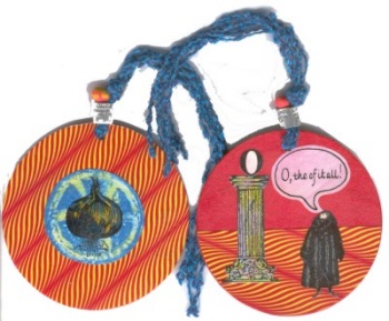
Mary Eaglesham Now Mary Eagleshams "O" is full of stuff. Heres what she wrote me. "I started off reading about Owls, but then you said "Abecedarian" - so I looked up The Alphabet Abecedarium: Some Notes on Letters by Richard A. Firmage, in which he mentioned James Thurbers The Wonderful O, about some pirates who sail their ship, The Aieu (no O), in search of treasure. The pirate chiefs mother once got stuck in a porthole, and they couldnt pull her in, so . Ever since, hes had a thing about the letter (shape?), which he proceeds to take out on the islanders where they set anchor. In fact, when they wont produce the treasure he tries to remove all the Os from their lives. And so it os. Anyway, the O on the pillar comes from the cover of Thurbers book. The man in furs is Edward Gorey - I was reading some interviews with him that had him quoted as saying, "O,The of it all!" (sic) is his motto. Try it - quite satisfying! The birdbands are contreband. Meant for herring gulls back in the 70s. Then there was an old fimo necklace, and a whole slew of beer mats Fabrication elation!"
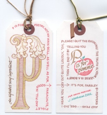
Judy Matheson Now, I was certain that Judy had used a Gocco to reproduce her tags.... Here is her cryptic comment!! :-) Pretty boring. Pigma pens, walnut ink & nibs, poor man's carbon. By #17, VERY boring. I'd think it out better another time around. Wow. |
Welcome
to issue 13 of byhand! If you wish to check
back issues of byhand click
here.
If you wish to contact me, my email address is: suzanne@quietfiredesign.com To subscribe: send me an email
saying 'subscribe'!
Please feel free to browse through my website Quietfire Design. There is now a link from my website to this newsletter, but I suggest that you bookmark the index page of this newsletter, so you can return here at any time. I have added a printable general
supply list for bookbinding classes to my website. May ChallengeI
know a lot of you keep journals and sketchbooks, and some of you take
them with you when you leave the house. I'd like to hear what art supplies
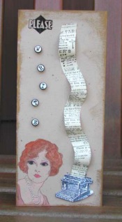
you take with you when you go out! Studio Tips I'm so glad Patti is sharing this tip with us. The samples she showed me were made with 1/4" grommets which you can pick up at Canadian Tire and follow the directions for installing them. They are absolutely charming!! Mini Faux Typewriter Keys I did the Tiny Art Journal first and because it was dark
colours I thought I should make something that shows up better so I made
the card Please Write. The stamps on the Please Write card
are from Non Sequitur. I'd be delighted to receive your favourite tips for inclusion here - we can all learn from them and probably save someone - like me - frustrations! Don't Forget!
For those of you who have taken the Coptic
Stitched Class, you may still acquire waxed linen thread from me.
It is $0.50/yard Cdn ($0.30/yard U.S. funds plus $2 for postage). Here is a list of the colours I currently have in stock:
It takes two yards of thread to complete the book as we made it. *Quietfire Design, Box 1231, Port Alberni, B.C. V9Y 7M1 Canada
|
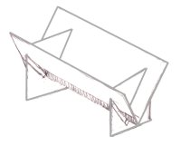
I have put together some sewing cradles for sale as some of you have been asking for them. They are not things of great beauty, but really, really handy for when you have a lot of holes to pierce. They are large enough for an 8.5" spine length and are $20Cdn (or $15US - to the States) shipping included. Email me if you can't live without one! I will try to bring these to classes so you can see them in person!
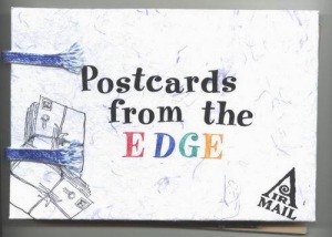
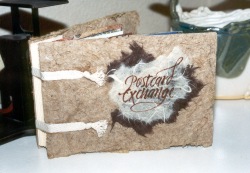
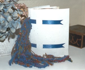
Booked Again! Due to overwhelming pressure (at least one person asked...!) I have included a new book structure for you to print out and try. Now, I also know that at least one other person has made the Postcard Accordion Display Book from the February byhand and she has graciously allowed me to reproduce the cover here (Thanks, Tracey!):
Accordion Display book by Tracey on the left - and I finally got the film out of the camera so here is the original book on the right - it looks kinda tipsy - sorry!! And that's all I need to encourage me to do another book structure..... Now, if you're like me, you have, over the years, bought lots of pretty cool greeting cards that you've never had any intention of sending to anyone (come on, be truthful!). They go into a pile and every once in a while you sort through them and admire them and put them back in a pile. Well, this new book is designed to hold and display those much loved cards. It is constructed similarly to the Postcard Accordion Display Book but with some significant changes. (There's sewing involved....sort of.) Well, here it is, the long awaited, ahem, sequel to the Accordion Display Book,
|
brace
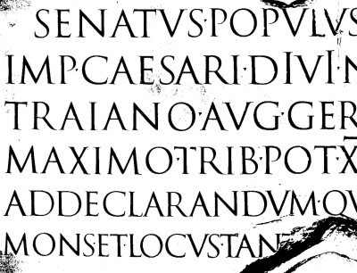
yourselves...History LessonRecently, Wendy Cowley of the Westcoast Calligraphy Society in Vancouver, asked me if I ever got to Vancouver during weekdays and, as she is the Programs person, would I be interested in doing an evening program on the history of calligraphy? She was recalling the information panels that I had made to accompany the exhibition I had several years ago here in Port Alberni. Unfortunately, escape during weekdays is hard to come by at this time in my life, but, well, d'oh, why not reproduce those panels here, seeing they are sitting around gathering moss.... Thanks, Wendy, for reminding me I had them! My exhibition included examples of most major western calligraphic hands in chronological order. There is a bit of bookbinding history, too. Here is the first installment: Roman Capitals |
|
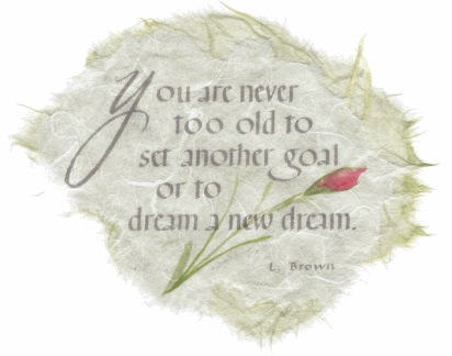
Gentle Thoughts
|
|
Teaching Schedule To get more details go to my website Calendar of Events page. Use the back button on your browser to return here. May 4 Port Alberni Spring Craft Fair P.A. Athletic Hall May 11,12 Calgary Artists
Journal in a Day Bow Valley Calligraphy
Guild May 25 Kelowna
Focus on Foundational Kelowna
Calligraphers Guild June 1 Vancouver Adding
Funk to Your Foundational July 13 Victoria Criss-Cross Coptic Paperworks Gallery And yes, can you believe it, I'm already booked into November '02! Here is the tentative schedule! (This is not on the Calendar page of the website yet.) Oct 5 Burnaby,
B.C. Criss-Cross Coptic* Nov 8,9,10 Port Alberni, B.C. Work
of Heart Craft Fair Nov 15,16 Duncan, B.C. Christmas Chaos Craft Fair Nov 23 Burnaby
Deluxe Photo Album* *Descriptions will be posted soon. |
|
If there is any information you would like to see in this newsletter,
let me know. Each month I will email you to let you know the new issue
is published. If you know someone who would like to receive notice of
byhand, just have them email me and I
will put them on the list. Bye for now and thanks for visiting! suzanne@quietfiredesign.com |
|
|
The original title lettering of byhand was done with a Mitchell's Roundhand Nib, size 0, and Higgins Eternal Ink. Quietfire Design Rubber stamps were used to create the other designs. |

 It's really
simple to make them. I find its best to install your grommets first as
you normally would. Then I typed up a page full of letters on my computer
onto light cardstock. I found a font that resembles an old typewriter
from a free font source (there is tons of them if you search). I printed
my words out double spaced and then used a font called Ghostwriter and
I made it 20 pt, you may have to adjust this depending on the font you
do use. Then I just took my regular single hole punch and punched out
a bunch of letters. You just glue the back of them onto the top of the
grommet. I sealed the top of letter and the grommet with jewelry glaze,
which is a glossy finish. I'm sure any kind of lacquer would work, the
jewelry glaze was just handy. Ta da! Thats it!
It's really
simple to make them. I find its best to install your grommets first as
you normally would. Then I typed up a page full of letters on my computer
onto light cardstock. I found a font that resembles an old typewriter
from a free font source (there is tons of them if you search). I printed
my words out double spaced and then used a font called Ghostwriter and
I made it 20 pt, you may have to adjust this depending on the font you
do use. Then I just took my regular single hole punch and punched out
a bunch of letters. You just glue the back of them onto the top of the
grommet. I sealed the top of letter and the grommet with jewelry glaze,
which is a glossy finish. I'm sure any kind of lacquer would work, the
jewelry glaze was just handy. Ta da! Thats it!