|
|
brought
to you in living colour by Quietfire Design
April 2006 - Issue 53
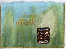
Hi there, ArtlingsWelcome to all the new subscribers! You've just tuned in to the 53rd issue of byhand! It's April, which means it's time to celebrate the anniversary of the byhand newsletter. So I'm announcing the
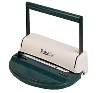
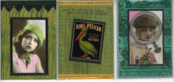
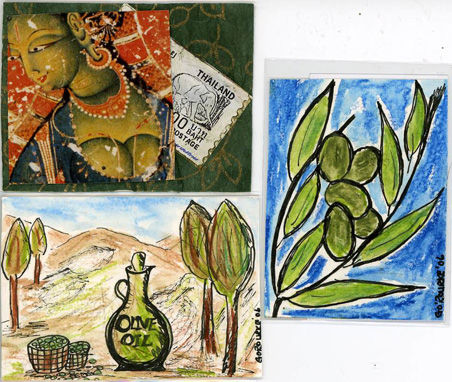
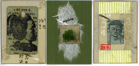
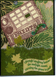
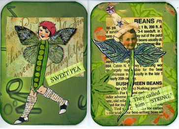
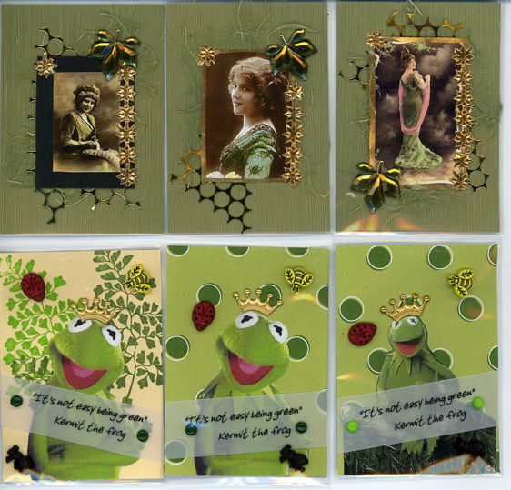
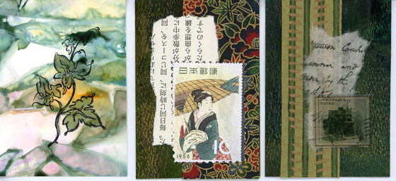
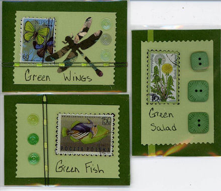
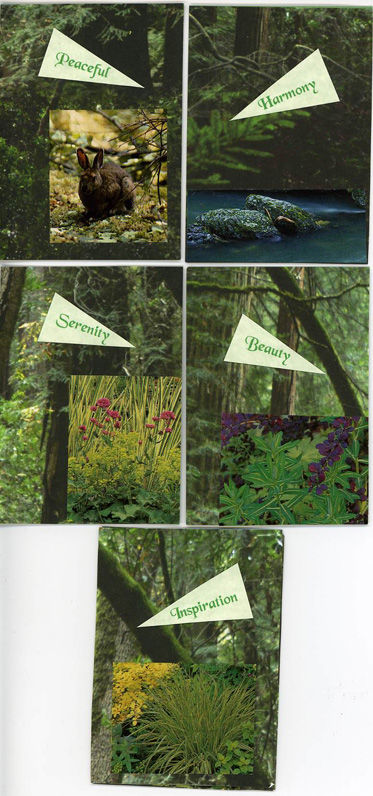
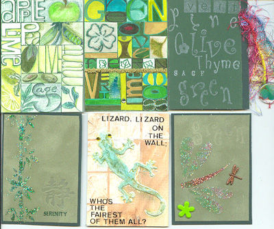
News on the Premium Subscriber Rubber! - it will be mailing out this week! Get ready to create! To see all the new rubber stamps, click
here! Judi Delgado Thanks so much ladies! Great quotations! Your rubber will be on its way shortly. Premium Subscribers may purchase the new rubber at sale prices. Wait for your email with all the information!
You'll notice some changes in the appearance of this newsletter. If you haven't already discovered it, you'll find there is a new menu at the top of the page. (And gee, I hope it's working correctly - I know I still need to tweak it!) In that menu you will find the galleries. One is the Project Gallery, which will have projects from past newsletters. I've already collected up four! The other new gallery is Suzanne's. It's just a few odds and sods that I've been creating lately. I though it might amuse you! I will be updating these galleries periodically. |
||||||
Please drop into my
other website: It changes every month!
|
I can't tell you how pleased I am that
you are offering product here on the island and it is available in Canada!
I also appreciate how easy you make ordering, answering questions and
shipping. Nadine M. - Victoria, BC
Please
add my "From" address (suzanne@quietfiredesign.com) to your address
book. This way your messages won't accidentally be sent to your JUNK
or TRASH folder.
If
you wish to contact me, my email address is: To
unsubscribe: send me an email saying 'unsubscribe'.
I'll live.... (sniff)
|
|||||
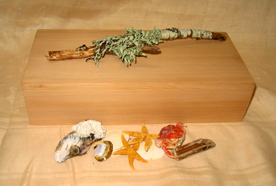
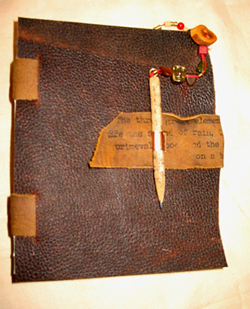
Quietfire 2006 RetreatWestcoast WhisperingsFriday evening, Saturday and Sunday, July 21-23, 2006
Planning for this year's retreat are coming right along. This year's project will be a book in a box, but not just any box. Read on...... We will be going on beach and
forest walks to collect treasures to decorate a locally-made finely
crafted cedar box. The same gentleman who creates my cedar book
covers will create the boxes sized just for us. Not only will the box
contain our collected treasures of twigs, shells, sea-glass and rocks,
but it will also be home to a very special handbound leather journal! As last year, there will be a spa evening (at my house this year!) and maybe some artsy field trips! Each participant will receive a goody bag. I'll see what I can do about lining up some massages! The workshop and the accommodation are both at the Best Western Barclay which will make it really convenient and relaxing. There is a special conference room rate and you are responsible for booking your own accommodation Mention you're part of the Quietfire Retreat! Continental Breakfast, all day
coffee, tea and treats and lunches are included in the cost of the Retreat. To reserve your spot for this special weekend, the cost is $100 CAD which becomes nonrefundable after June 1, 2006. The balance of $120.00 is due at that time. Please check with me for availability at the retreat before you book your room! To register email suzanne@quietfiredesign.com
|
|
|
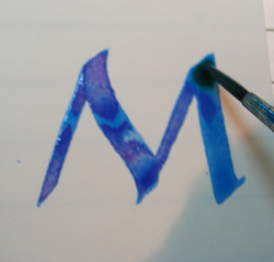
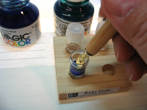
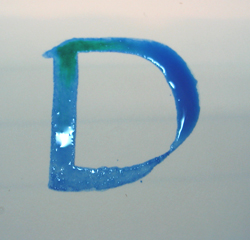
Make your first letter. |
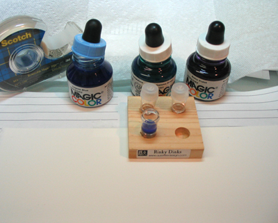
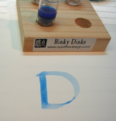
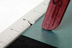
Sometimes the pen doesn't lay down a juicy enough amount of ink (see the photo to the left) and the watercolour paper sucks up your letter. If so, you can go back in while the area is still damp and just press your pen into the letter area to allow more ink to flood in. |
|
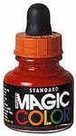
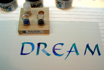
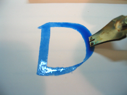
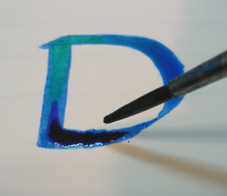
Dampen your pointed brush in water and blot it on paper towel. I droppered the Gamma Green Magic Color onto the pointed brush and touched the brush to the wet letter where I wanted the new colour. If the letter has dried out, the new ink will not blend or spread, but remain in an unattractive dab! I should have waited until this letter dried out a little bit more before I dropped in the colour! It would have blended better. |
Here you can see the Gamma Green blending into the Lagoon Blue and spreading. You can tip your page to encourage spreading. Mind you, this letter was a bit too juicy around the bowl of the D to attempt that..... If you have too much ink in your letter, there is a solution. Just like when you paint with watercolours, you can twirl a tissue or paper towel into a fine point and go into the puddle to suck out excess colour and moisture. |
|
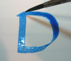
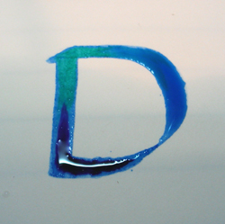
Dampen your other pointed brush, blot, then dropper the Delta Violet onto the brush. Touch your brush to the part of the letter where you want the new colour. (Not bad for a photo where I was holding the camera upside down so I could press the button and looking through the view screen and drop in Delta Violet colour!) |
You can see the colour spreading, but in retrospect, I wish I had diluted the Delta Violet as it overpowered the Lagoon Blue. Once again, I could have waited till the base colour dried a bit more. Keep in the back of your mind that, just like in watercolour painting, some colours move better than others. You may get a nicer effect using a different combination of colours or diluting the ones you're working with. |
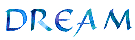
Here is another letter (sorry it's a bit out of focus - another left handed upside down photo). I had diluted the Delta Violet by this time and it was blending much more subtly than before.
Here is the completed word, still wet.
Timing is very important for this technique and only a bit of practice will allow you achieve the results you want. Any rhythm you might normally have when you are lettering goes out the window as you must blend each letter when it's wet. Sometimes if I'm particularly bold, I'll get a couple done at a time. Stopping to take photos is not recommended!! The letterforms and spacing go down the tube!
|
2006 Current Schedule
To see a complete list (more or less!) of the classes Suzanne teaches, click here! |
|||||||||||||||||||||||||||||||||
|
Artists whose work is shown in this newsletter retain the copyright on their own work.
| byhand Newsletter | Quietfire Design home page |
| Calligraphic Art | Handbound Books | byhandproducts | Ordering Information |
| Publications | Exhibitions | Classes | About Us |
©
2006 Suzanne Cannon
This newsletter is for the personal use of the subscriber and may not be reproduced
without written permission from Suzanne. You are welcome to email or print it
in its entirety to share with friends, but ask that you include this copyright.
Thank you for your help and your understanding.


 In
addition, on the Friday evening after the reception and registration,
artist Nancy Quinn will be leading us in creating a little felted book
which will be completed on Sunday (when it's dry!).
In
addition, on the Friday evening after the reception and registration,
artist Nancy Quinn will be leading us in creating a little felted book
which will be completed on Sunday (when it's dry!).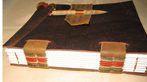
 The
Sale continues!
The
Sale continues!